
Launch responsive design in minutes
Bootstrap is a CSS framework that was created to assist with certain repetitive CSS tasks. For example, each website has a navigation. Bootstrap allows you to easily implement a navigational menu that automatically adjusts to any screen width. Most of the time we are left without writing any CSS code whatsoever for this specific feature. Bootstrap also utilizes the 12-column grid that UX designers love. As a brief example of the grid, let’s say that you wanted to place two containers next to each other. You can span any length as long as the total width equals 12 columns. The first container can occupy 6 columns and the second container can occupy 6 columns.

The first container can occupy 3 columns and the second container can occupy 9 columns. Any combination will work as long as the total equals 12. We’ll talk more about the grid later in this article series. There are hundredths of features that come with the Bootstrap framework; we’ll discuss some of the big ones. Bootstrap does come pre-packaged with JavaScript code as well. We will not be discussing that in this article.
Installing Bootstrap
There are two main ways to use the Bootstrap framework. One is through CDN (Content Delivery Network) and the other is by downloading the code directly and including it. If the user has been on another website that uses the CDN Bootstrap code, it will already be cached on the user’s computer and will ultimately load faster on the new site.
Download and Install
We’ll start by going to https://getbootstrap.com/.

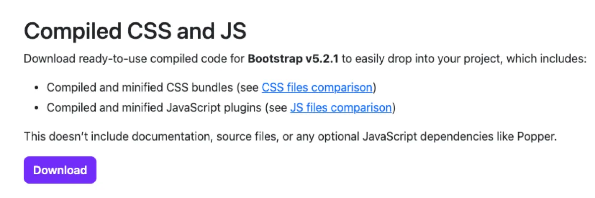
Clicking on the download link on the main screen will open another page that contains Download options. Although there are numerous options available, we’ll focus on the “Compiled CSS and JS” download link.
We’ll extract the files that are packaged inside the zipped folder and move them to our project root directory. There should only be two folders in there: css and js. If you have other folders and files, you most likely clicked on the Download button in the navigational menu.
Opening the css folder, you’ll notice many different files. We won’t dwell on what they mean but one key difference is that the minified versions contain a smaller footprint. Since we’re not going to be modifying any of the code inside the Bootstrap file, we’ll use the minified version for our includes. The bootstrap.min.css file is the file that we’ll be including inside of our HTML document. We’ll also need the JavaScript Bootstrap file. There are a couple of different types of JavaScript files inside the js folder. The first one is the bundle.js file. It contains the Popper JS library. The other is the standard Bootstrap file without popper. We’ll use the bootstrap.min.js file. To learn more about Popper, visit https://popper.js.org/.
We can clean out the unused css and js bootstrap files by simply deleting them. Your css folder should now only have one file, bootstrap.min.css, and your js folder should only contain the bootstrap.min.js file.
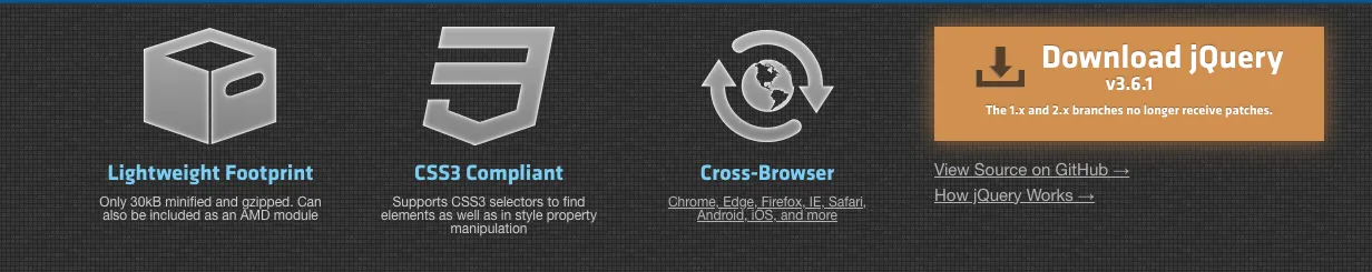
One last thing that we’ll have to download before we can start including Bootstrap into our website is jQuery. jQuery is a JavaScript library that does not come packaged with Bootstrap but is required for Bootstrap to work. We can obtain jQuery from https://jquery.com/. On the jQuery website, we’ll click on the “Download jQuery” button.
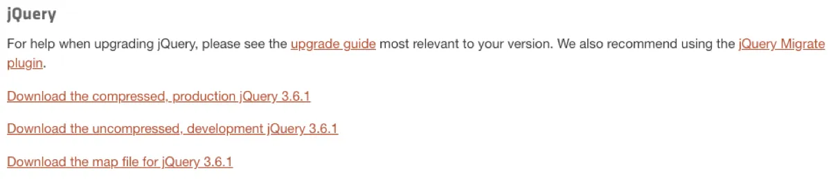
This will open the download page. We’ll chose the first option that states “Download the compressed production jQuery x.x.x.” You will right-click on that link and select “Save Link As” if you’re using Chrome, or something similar in other browsers, in order to save the file to your computer. Navigate to the js folder in your project’s root folder. Make sure that the file has a .js extension before you click save.
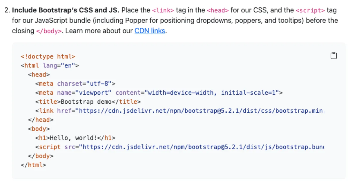
Let’s start the process by creating the index.html page and adding the Bootstrap includes that are necessary to make Bootstrap work. We’ll include the CSS file inside the <head> tag and the JavaScript files at the end of the document, right before the closing </body> tag. We normally include JavaScript files at the end so that they don’t tie up other components on the page from loading beforehand. Since Bootstrap uses jQuery, the jQuery library will need to be included before the Bootstrap JavaScript file.
<!DOCTYPE html>
<html lang="en">
<head>
    <meta charset="UTF-8">
    <meta http-equiv="X-UA-Compatible" content="IE=edge">
    <meta name="viewport"
          content="width=device-width, initial-scale=1.0">
    <link rel="stylesheet" href="../css/bootstrap.min.css">
    <title>Article 3-1</title>
</head>
<body>
    <script src="../js/jquery-3.6.1.min.js"></script>
    <script src="../js/bootstrap.min.js"></script>
</body>
</html>
That’s it. You’ve successfully installed Bootstrap onto your system. Before we attempt an example, let’s run through the CDN installation process.
CDN Installation Process
Start by visiting https://getbootstrap.com/. This time, we’ll click on the “Read the docs” button.

Scrolling down, you will see a starter template section. We’ll copy the code from the starter template and add it to our index.html page.
And that’s it. You are setup. Much easier to install CDN right?
Testing Bootstrap Installation
Once we’re through with the installation process, we can test out some of the Bootstrap features. Let’s go back to https://getbootstrap.com/ and this time click on the Examples link inside the navigation menu.
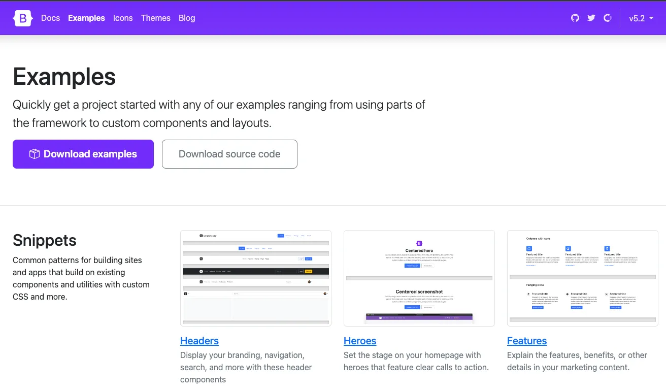
You will be presented with numerous different examples. You’re welcome to experiment with all of them. Download the Example code to try it out yourself.
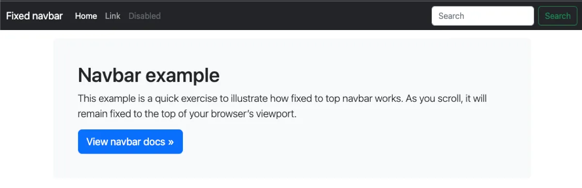
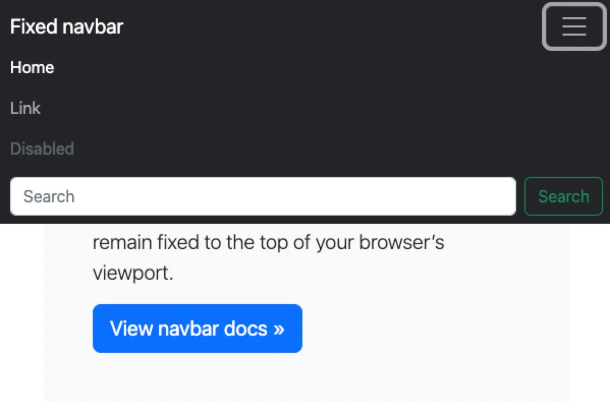
Once downloaded, open it up in your editor. You’re more than welcome to go through each example. We’ll focus primarily on the Navbar fixed example.
Open the Navbar fixed link to open up the page. You will be greeted with a page that looks like the one below.
We can experiment with Bootstrap’s responsiveness by resizing the screen. Once you get into the mobile range, the navigation menu will turn into a mobile friendly menu.
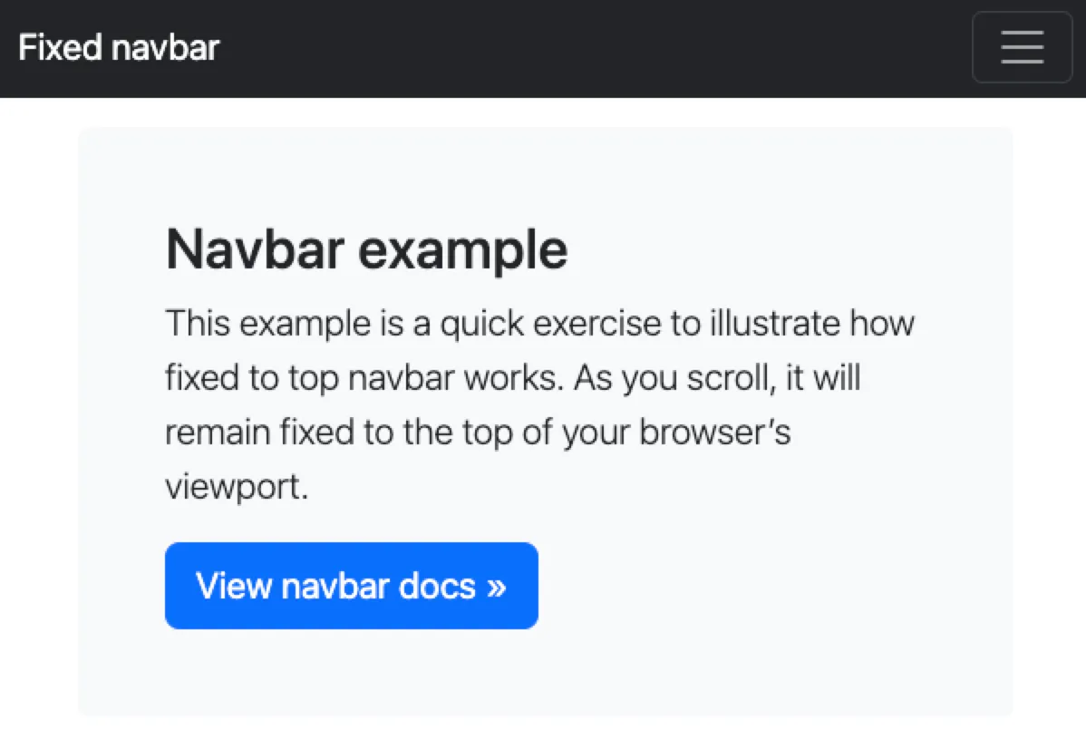
Clicking on the burger menu will expand the navigational links. Those links are visible on the desktop version but collapse on the mobile version.
We’ll dwell further into the navigation menu in later articles.
BOOTSTRAP Series
Continue your Bootstrap Learning.
Launch responsive design in minutes
Bootstrap — P1: Introduction and Installation
Part one of our Bootstrap essentials series introduces the framework’s history, core features, and quick install methods via CDN, package managers, and CLI. Set up your dev environment and render your first responsive grid in minutes.