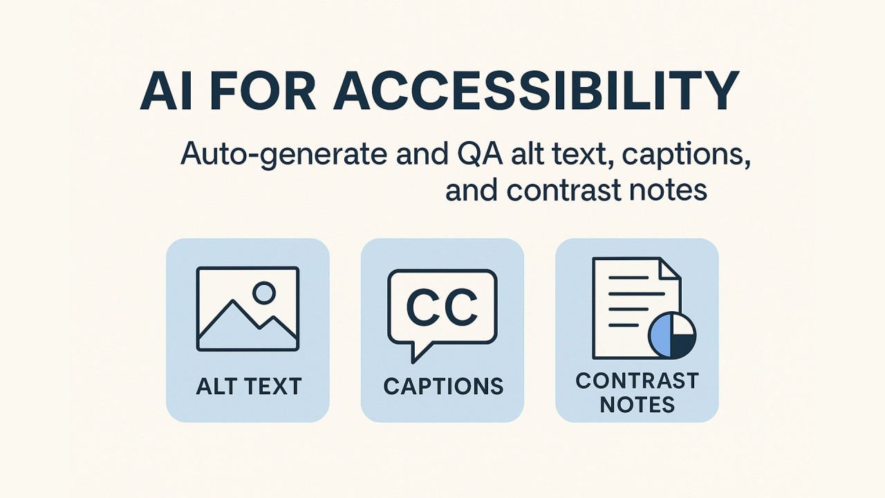
Roughly 1.3 billion people (about 16% of the world) live with significant disability. Accessibility isn’t a checkbox; it’s how people actually use your content. AI can take the repetitive parts off your plate while humans keep judgment and nuance.
What “good” looks like
Alt text: Clear, concise, purpose‑driven. Use empty alt=”” for decorative images; add long descriptions for complex visuals like charts. The W3C’s alt decision tree is the north star here.
Captions: All prerecorded video needs synchronized, accurate captions (speech + key sounds). Auto‑generate, then review for names, numbers, acronyms, and brand terms.
Contrast: Aim for 4.5:1 minimum for normal text and 3:1 for large text; push higher when you can. For icons and UI components, ensure 3:1 non‑text contrast. Consider AAA’s 7:1 for high‑priority text.
The 3‑Layer Accessibility Workflow (Generate -> QA -> Govern)
1) Generate
- Alt text: Use an LLM to describe what matters in context (who/what/action/setting), not just what’s in the pixels.
- Captions: Use speech‑to‑text to draft; run a language model pass for punctuation, casing, speaker labels, and sound cues like [music] or [laughter].
- Contrast notes: Programmatically compute color contrast across brand tokens and sizes; create a “notes” report that flags fails and suggests passing alternatives within your palette.
2) QA
- Alt text QA: Compare to ground truth (product metadata, post copy). Flag hallucinations, over‑descriptions, or duplication of nearby text. Prefer one short sentence; escalate to long description for complex images.
- Caption QA: Check technical terms, names, timing alignment, and non‑speech cues; confirm compliance with WCAG caption criteria.
- Contrast QA: Validate against WCAG thresholds for text and non‑text. Note edge cases like thin fonts and anti‑aliasing; aim to exceed the minimum where possible.
3) Govern
- Log versions and reviewers.
- Store contrast “fix recipes” (for example, token swaps that pass for each text size).
- Track coverage and correction rates to prove improvement over time.
Quick wins: Checklists your team can use
Alt text checklist
- Does it convey the image’s purpose in this page’s context?
- Is it concise and specific (no “image of” filler)?
- If decorative, is alt=”” correctly used?
- If complex (infographic/chart), is the detail provided elsewhere?
Captions checklist
- All speech included, synced, and readable.
- Important sounds labeled.
- Names, acronyms, and numbers verified.
- Follows WCAG’s “Captions (Prerecorded)” success criterion.
Contrast checklist
- Text vs background: ≥4.5:1 (normal) or ≥3:1 (large).
- UI icons and components: ≥3:1.
- Thin/ultra‑light fonts checked visually, not just by math.
Prompt pack (copy/paste)
Alt text generator
You are an accessibility editor. Given page context and the image, write one short sentence of alt text that captures the image’s purpose for this page. Avoid “image of.” If purely decorative in this context, return: decorative.
Alt text QA
Compare the proposed alt text to the provided metadata and nearby copy. Flag any inaccuracies, brand/term mismatches, or redundancy. If improvements are needed, return a revised alt and a one‑line reason.
Captions enhancer
Clean this transcript for captions: sentence case, punctuation, speaker labels, and non‑speech cues like [music] or [applause]. Keep meaning faithful. No paraphrasing.
Contrast notes generator
Given these color tokens, text sizes, and states, list any failures against WCAG thresholds and propose nearest‑palette alternatives that pass. Include the target ratio and the new token pair.
“Good vs. better” examples
Product image (e‑commerce)
- Weak: “Wheel on a car.”
- Good: “20×10 black milled off‑road wheel on a silver pickup, front three‑quarter view.”
- Better (with context): “20×10 black milled wheel on a silver pickup, front three‑quarter view, used on our ‘F‑150 fitment’ page.”
Hero photo (event recap)
- Weak: “Car meet at night.”
- Good: “Row of tuner cars under warehouse lights; crowd in background.”
- Better (contextual): “Row of tuner cars under warehouse lights at the Atlanta show, main stage in background.”
Chart (complex)
- Alt: “Bar chart of monthly sales by category.”
- Long description (in body or modal): include axes, categories, and the key trend; don’t cram this into alt.
Metrics
- Alt text coverage: % of images with valid alt (excluding decorative).
- Correction rate: % of AI outputs requiring edits by humans.
- Caption completeness: sampled WER (word error rate) + # of issues per 10 min.
- Contrast pass rate: % of components/text styles passing; # of shipped “fix recipes.”
- Time saved: minutes saved per asset vs. manual baseline.
Common pitfalls to avoid
- Treating the 4.5:1 ratio as a ceiling. It’s a floor…exceed it where you can.
- Stuffing complex data into alt. Link or embed a long description instead.
- Relying solely on auto‑captions without a human pass, especially for names and jargon.
- Ignoring non‑text contrast for icons and controls.
AI removes the grind; your people preserve meaning, tone, and respect. Build the habit, track the wins, and let accessibility become just how you ship.