Catch bugs before they hit the browser
Testing CSS is simple when you’re using the correct tools. One tool that we’ll cover is Google DevTools that comes packaged with Google Chrome. To access DevTools, right click on your site and click Inspect. You will be greeted with a page that looks like this.

The left side contains your website as is viewed for that screen resolution. To the right is the HTML code and underneath is the CSS code. The border that separates the left and right sides can be dragged to the left or right to resize the panel containing the web page. While you’re resizing the page, the screen resolution will appear in the top right corner of the web page panel.
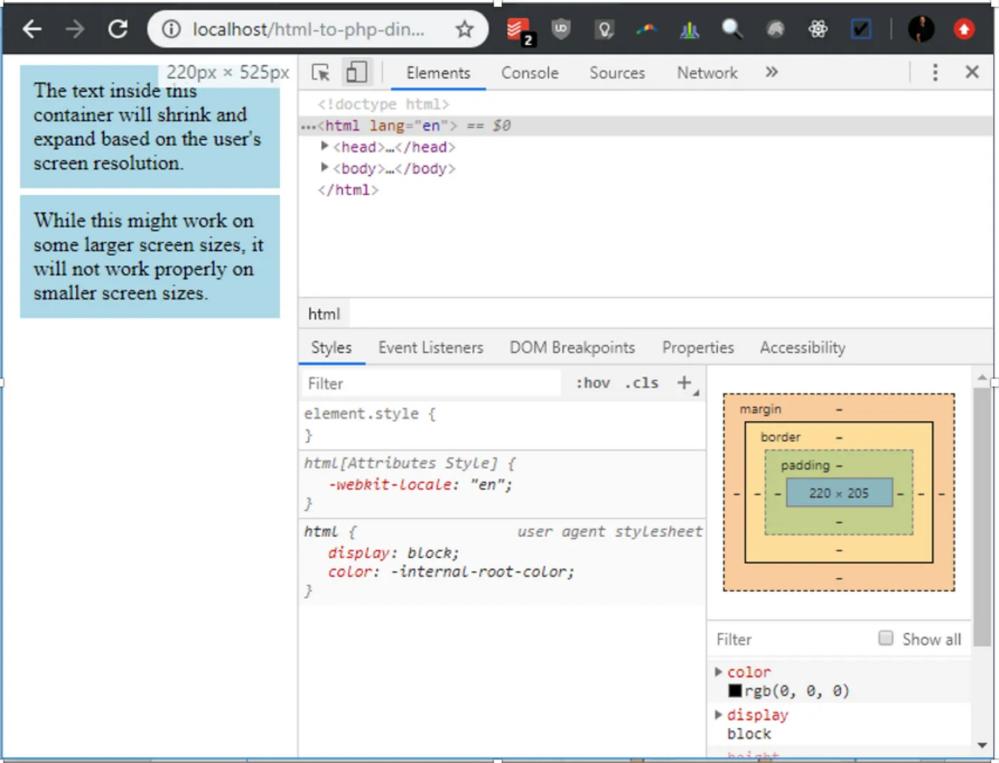
In order to inspect the HTML and CSS of each element on the page, you can click on the button that says “select an element in the page to inspect it” when you hover over it or press Ctrl + Shift + C on Windows or Command + Shift + C on a Mac.

Once selected, you can click on elements in your page to see the HTML markup and CSS code. You’ll also notice that the top right panel has the element highlighted and the CSS code pertaining to that element is visible in the bottom right corner.

If you hover over the element with the selection tool, a box will appear with details about the element. It displays information such as the text color, font style, background color, margin, and padding.

You might have noticed also that different colors appear surrounding the element. If you look to the right of the screen at the box model, you’ll see how those colors relate. The blue color represents the content. The box model states that the content area is 174px wide and 72px high. The green color shows the padding. According to the box model, there is a 10px padding surrounding the content area. We can verify that by looking at the padding property inside the CSS panel for the div attribute. There is no border so that color does not appear on the element. There is a 5px margin and that is verifiable on the box model.
You can also hover over each portion of the box model to select the area that’s represented for that element.

Once the element is selected, changes can be made directly to the styling by modifying the CSS directly in the CSS panel. This makes for easier experimental testing. Once you’re satisfied with how everything looks, you can then add the CSS code to your stylesheet. Let’s change the background-color from light blue to yellow. Click on the lightblue value. It should highlight.
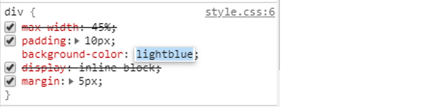
Now simply enter yellow. You’ll see the changes appear on the left side of the screen.

You can also add other properties to the element by clicking inside the element inside the CSS panel but making sure not to click on any existing properties or values.

Let’s add a bold font weight. If you look at the web page panel, you’ll notice that the font weight has changed.

You might have also noticed that some properties have a line going through them. This means that the property is being overridden somewhere else inside the CSS stylesheet. If we wanted to find where the max-width property is being overridden, we can scroll through the CSS panel and look for it.

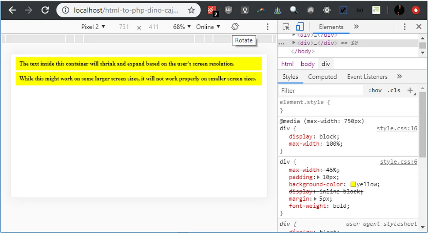
In this case it was simple to find. It turns out that due to the small screen resolution, the @media query overrides the max-width property and sets it to 100%.
You can also emulate devices for even further testing. To see a list of devices, click on the “toggle device toolbar” button. You can also access it by pressing Ctrl + Shift + M on Windows or Command + Shift + M on a Mac.

The website panel will transform, and you will be presented with device choices.

If you leave the screen as responsive, you can adjust the screen width and height by dragging the edges. You can also choose one of the predefined resolutions to see how your site will appear on that device. Let’s start by selecting the Pixel 2 from the dropdown. You’ll notice that the Pixel 2 is now selected, and the screen resolution has been changed to 411px x 731px.

You can also click on the phone rotation button to see what the website would look like in landscape view.
CSS Series
Continue your CSS Learning.

One stylesheet, every screen
CSS — P10: Responsive Web Design
Part ten of our CSS fundamentals series unlocks responsive web design. Learn mobile-first thinking, fluid grids, flexible images, and breakpoints with media queries and container queries—empowering sites that adapt flawlessly from tiny phones to ultra-wide monitors.
Catch bugs before they hit the browser
Part eleven of our CSS fundamentals series focuses on testing. Explore cross-browser checks, responsive breakpoints, automated visual-regression tools, and unit snapshots with Playwright or Jest. Build a safety net that flags layout shifts and style regressions before users ever notice.