Typography and colors, tamed
Before we jump into the more intermediate features of bootstrap, we’ll first explore some of the basic styles that you might come in to contact with. In order to make your site responsive using bootstrap, you must include the container style.
https://www.dinocajic.com/bootstrap-p1-and-installation/
<!doctype html>
<html lang="en">
<head>
    <meta charset="utf-8">
    <meta name="viewport"
          content="width=device-width, initial-scale=1">
    <title>Text and Colors</title>
    <link href="https://cdn.jsdelivr.net/npm/bootstrap@5.2.1/dist/css/bootstrap.min.css" rel="stylesheet" integrity="sha384-iYQeCzEYFbKjA/T2uDLTpkwGzCiq6soy8tYaI1GyVh/UjpbCx/TYkiZhlZB6+fzT" crossorigin="anonymous">
</head>
<body>
    <div class="container">
        <h1>Bootstrap Example</h1>
        <p>Bootstrap look a lot nicer on the screen</p>
    </div>
    <script src="https://cdn.jsdelivr.net/npm/bootstrap@5.2.1/dist/js/bootstrap.bundle.min.js" integrity="sha384-u1OknCvxWvY5kfmNBILK2hRnQC3Pr17a+RTT6rIHI7NnikvbZlHgTPOOmMi466C8" crossorigin="anonymous">
    </script>
</body>
</html>

Opening the page inside your browser will display the text with the bootstrap styling. You’ll notice that the text is centered and that padding appears to the left and the right of the text.

Bootstrap Text
Bootstrap uses the device’s default font, which helps minimize the overall CSS file size. That also means that the font on your website will appear different on Windows, Mac, Linux, etc. You can specify the font in your own custom CSS file however that can be used alongside Bootstrap.
We’ll only cover a couple of bootstrap styles related to text. The first one is the text-alignment style. Text alignment allows you to align text to the left, center or right.
text-starttext-centertext-end
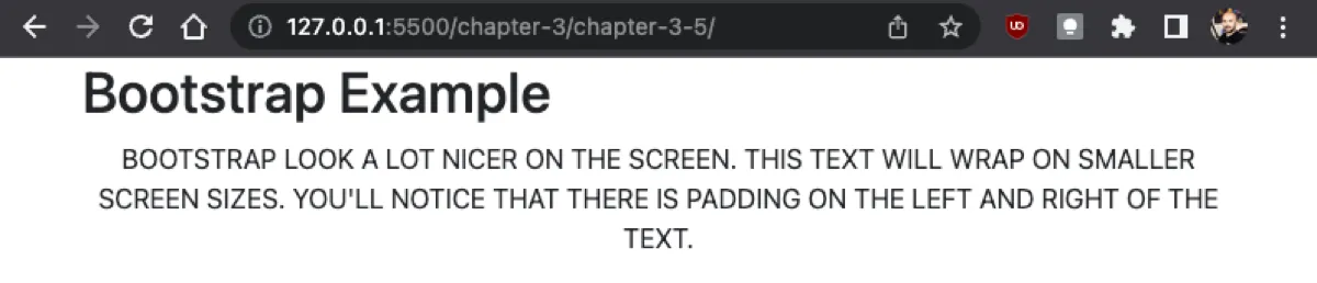
You will use the class attribute to add bootstrap styles to your markup. Let’s add the text-end style to the previous example.
<p class="text-end">
    Bootstrap look a lot nicer on the screen. This text will wrap
    on smaller screen sizes. You'll notice that there is padding
    on the left and right of the text.
</p>

You can also align text differently based on the screen size. You might want to align text to the left on smaller devices, center it on medium sized devices, and align it to the right on large devices. You can achieve that with the following styles:
text-sm-starttext-md-starttext-lg-start- text-xl-start
- …
text-sm-center- …
text-sm-end
You’ll also be able to transform text with the following properties:
text-lowercasetext-uppercasetext-capitalize
We’ll add the text-uppercase style to our markup to see the visual transformation. Just like adding multiple regular CSS classes to your markup, we can also add multiple bootstrap classes by separating each class with a space.
<p class="text-center text-uppercase">
    Bootstrap look a lot nicer on the screen. This text will
    wrap on smaller screen sizes. You'll notice that there
    is padding on the left and right of the text.
</p>
The best part of most of these styles is that they’re self-explanatory. That’s why I did not provide an explicit explanation for most of the styles in this section. Several other styles can be applied to the font to change the appearance of it, such as:
fw-boldfw-bolderfw-semiboldfw-normalfw-lightfw-lighterfst-italicfst-normal
These styles should not be substitutes for your overall website structure. For example, just because you can make text inside a paragraph look like a heading, it doesn’t necessarily mean that you should.
Text-Colors
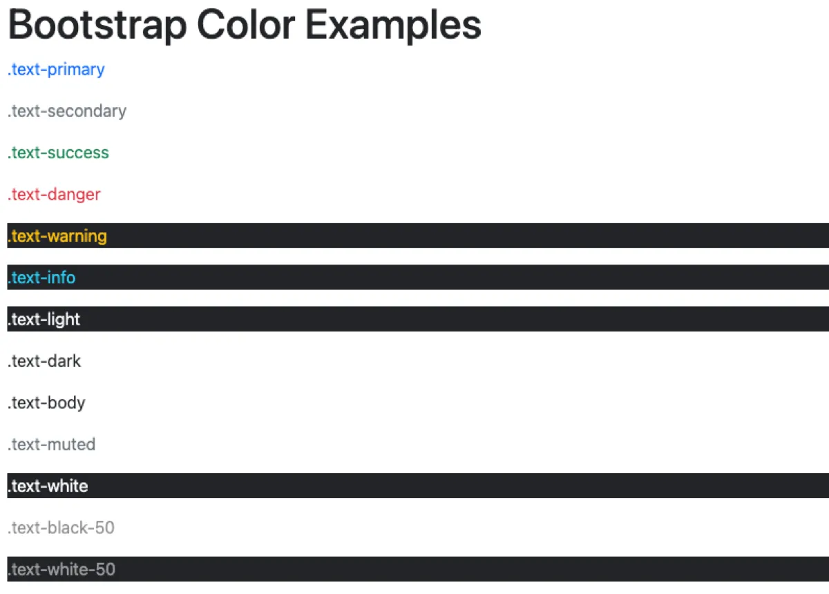
The Bootstrap team has created some default colors for you to use. These include,
text-primarytext-secondarytext-successtext-dangertext-warningtext-infotext-lighttext-darktext-bodytext-mutedtext-whitetext-black-50text-white-50
Whenever I create applications, I try to make the following colors work. Rarely do I start getting “creative” and attempt to change the default colors. Let’s take a look at all of them in action.
<p class="text-primary">.text-primary</p>
<p class="text-secondary">.text-secondary</p>
<p class="text-success">.text-success</p>
<p class="text-danger">.text-danger</p>
<p class="text-warning bg-dark">.text-warning</p>
<p class="text-info bg-dark">.text-info</p>
<p class="text-light bg-dark">.text-light</p>
<p class="text-dark">.text-dark</p>
<p class="text-body">.text-body</p>
<p class="text-muted">.text-muted</p>
<p class="text-white bg-dark">.text-white</p>
<p class="text-black-50">.text-black-50</p>
<p class="text-white-50 bg-dark”>.text-white-50</p>
Background Colors
The above example also transitions us into the next category: background colors. They’re identical to the text colors but they begin with bg– instead of text-.
bg-primarybg-secondarybg-successbg-dangerbg-warningbg-info- …
In order to see some of these colors more clearly, we’ll add a p-3 style, which is just a padding, to each div container.
<div class="p-3 bg-primary text-white">.bg-primary</div>
<div class="p-3 bg-secondary text-white">.bg-secondary</div>
<div class="p-3 bg-success text-white">.bg-success</div>
<div class="p-3 bg-danger text-white">.bg-danger</div>
<div class="p-3 bg-warning text-dark">.bg-warning</div>
<div class="p-3 bg-info text-dark">.bg-info</div>
<div class="p-3 bg-light text-dark">.bg-light</div>
<div class="p-3 bg-dark text-white">.bg-dark</div>
<div class="p-3 bg-body text-dark">.bg-body</div>
<div class="p-3 bg-white text-dark">.bg-white</div>
<div class="p-3 bg-transparent text-dark">.bg-transparent</div>

Button Colors
Colors can also be applied to buttons. Again, a similar naming convention is used to apply a specific button style.
btn-primarybtn-secondarybtn-success- …
<button type="button" class="btn btn-primary">btn-primary</button>
<button type="button" class="btn btn-secondary”>
    btn-secondary
</button>
<button type="button" class="btn btn-success">btn-success</button>
<button type="button" class="btn btn-danger">btn-danger</button>
<button type="button" class="btn btn-warning">btn-warning</button>
<button type="button" class="btn btn-info">btn-info</button>
<button type="button" class="btn btn-light">btn-light</button>
<button type="button" class="btn btn-dark">btn-dark</button>
<button type="button" class="btn btn-link">btn-link</button>

BOOTSTRAP Series
Continue your Bootstrap Learning.

Launch responsive design in minutes
Bootstrap — P1: Introduction and Installation
Part one of our Bootstrap essentials series introduces the framework’s history, core features, and quick install methods via CDN, package managers, and CLI. Set up your dev environment and render your first responsive grid in minutes.
Typography and colors, tamed
Bootstrap — P2: Text and Colors
Part two of our Bootstrap essentials series shows how to master typography and color. Explore display, lead, and text-utility classes, apply context colors and backgrounds, and tweak the Sass maps for on-brand palettes.

Space elements the smart way
Bootstrap — P3: Margin and Padding
Part three of our Bootstrap essentials series drills into spacing utilities—margin (m*) and padding (p*) helpers, responsive breakpoints, and directional shorthands. Learn to compose clean layouts fast without custom CSS.