Make every pic fit perfectly
Image responsiveness is on top of the list for making a site responsive. Bootstrap has an easy class called img-fluid. The img-fluid style sets the image width to the width of the container and makes the height proportional.
https://www.dinocajic.com/bootstrap-p4-buttons/
<div class="col-4 m-1">
    <img
        src="pocket-watch.jpg"
        class="img-fluid"
        alt="Pocket Watch">
</div>
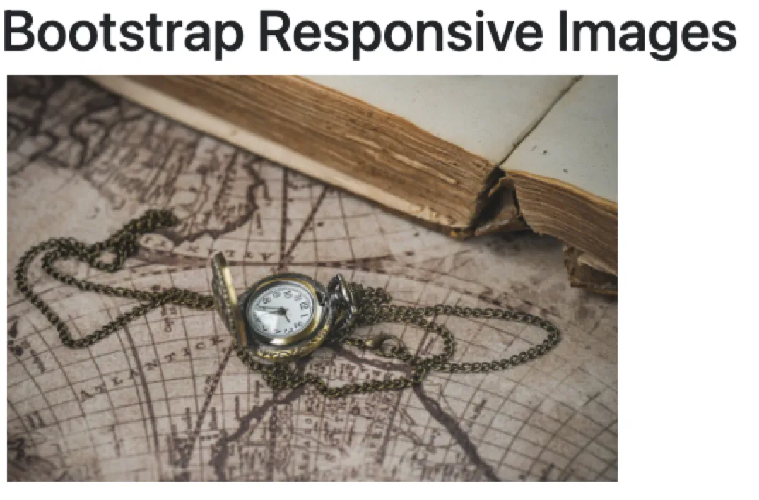
In the example above, we add a col-4 class to the outer container. Currently, just know that there are 12 columns that we can use, and we’ve set the div container to take up 4 columns, or roughly 1/3rd of the page. We’ll discuss columns later. The image class is set to img-fluid. This ensures that the image takes up 100% of the container on each screen resolution.
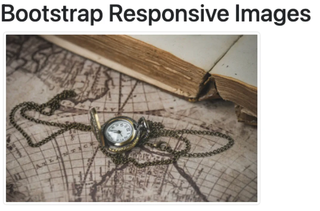
Another class that you’ll likely run into is the img-thumbnail class. Although it doesn’t resize your image into a thumbnail, it does add a 1-px border around it.
<div class="col-4 m-1">
    <img
        src="pocket-watch.jpg"
        class="img-thumbnail"
        alt="Pocket Watch">
</div>
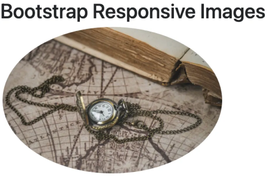
In the previous articles on CSS, we also made a rounded image. By adding the class rounded-circle to the img class attribute, we can easily accomplish the same thing with Bootstrap.
<div class="col-4 m-1">
    <img
        src="pocket-watch.jpg"
        class="img-fluid rounded-circle"
        alt="Pocket Watch">
</div>
Other rounded border bootstrap classes include:
roundedrounded-toprounded-endrounded-bottomrounded-startrounded-circlerounded-pill
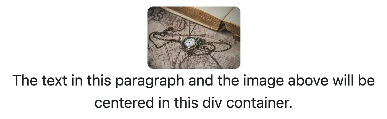
Lastly, to center an image inside a container, you will use the text-center class. Since the image is set to display: inline by default, the text-center class will work on it. The text-center property is applied to the container and not to the image tag itself.
<div class="col-4 m-1 text-center“>
    <img
        src="pocket-watch.jpg"
        class="rounded"
        style="width: 100px;"
        alt="Pocket Watch">
    <p>
        The text in this paragraph and the image above
        will be centered in this div container.
    </p>
</div>
In this example, we added the text-center class to the div container. Since the image was rather large, we also added an inline style to reduce the size of it. This was only done so that the effect can easily be seen.
BOOTSTRAP Series
Continue your Bootstrap Learning.

Click-worthy styles in a single class
Part four of our Bootstrap essentials series dives into buttons—primary, outline, and link variants, size modifiers, block display, and button groups. Learn how to mix utility classes, toggle states, and tailor colors in Sass for on-brand, accessible CTAs.
Make every pic fit perfectly.
Bootstrap — P5: Responsive Images
Part five of our Bootstrap essentials series shows how to keep images sharp and adaptable with .img-fluid, responsive picture sources, alignment classes, and lazy-loading tips—ensuring perfect fit on every device.