Know your edges, own your layout
Block type elements live on the principle of the box model. The box model is made up of:
Content Box
- Changes the size of the content box
- Uses width and height properties
Padding Box
- Adds whitespace around the content
- Uses the padding property
Border Box
- Adds a border around the padding box
- Uses the border property
Margin Box
- Adds whitespace between the border and other HTML elements
- Uses the margin property

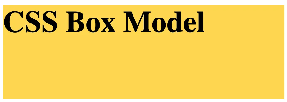
The easiest way to explain the box model is through an example. We’ll start by creating an <h1> element and setting the background color of it to light amber.
<h1>CSS Box Model</h1>
/* CSS */
h1 {
    background-color: #FFD54F;
}

We can start modifying the content portion of the box model with the width and height properties. The width and height properties will change the size of the container.
h1 {
    background-color: #FFD54F;
    width: 300px;
    height: 100px;
}
Next, we’ll add padding by using the padding property. Padding will also change the width and height of the container since additional pixels are being added. Padding values can be added as follows:
padding: 30px;
- Adds a
30pxpaddingaround the content
padding: 10px 25px;
- Adds a
10pxpaddingabove and below the content and a25pxpaddingto the left and right of the content
padding: 10px 30px 20px;
- Adds a
10pxpaddingabove the content,30pxpaddingto the left and to the right of the content, and a20pxpaddingbelow the content
padding: 10px 25px 5px 30px;
- Adds a
10pxpaddingabove the content,25pxpaddingto the right of the content,5pxpaddingbelow the content, and a30pxpaddingto the left of the content
padding-top: 10px;
- Adds a
10pxpaddingabove the content
padding-right: 10px;
- Adds a
10pxpaddingto the right of the content
padding-bottom: 10px;
- Adds a
10pxpaddingbelow the content
padding-left: 10px;
- Adds a
10pxpaddingto the left of the content
h1 {
    background-color: #FFD54F;
    width: 300px;
    height: 100px;
    padding: 30px;
}

Setting a border involves adding the border property to the outer edge of the padding box. Just like padding, there are numerous acceptable values for the border property. We’ll cover only two:
border: solid;
- Adds a
solidblackborderaround the padding box. - Other styles include:
dotted,dashed,double,groove, etc.
border: 2px solid;
- Adds a
2pxsolidborderaround the padding box.
h1 {
    background-color: #FFD54F;
    width: 300px;
    height: 100px;
    padding: 30px;
    border: 5px solid;
}

Adding a margin pushes the border box away from other HTML elements. We can illustrate it with the following example. We’ll start by inserting a <p> element below the <h1> element. We’ll add some styling to the paragraph for easier visualization.
<h1>CSS Box Model</h1>
<p>Paragraph Box</p>
/* CSS */
h1 {
    background-color: #FFD54F;
    width: 300px;
    height: 100px;
    padding: 30px;
    border: 5px solid;
}
p {
    background-color: powderblue;
    padding: 30px;
    width: 300px;
}
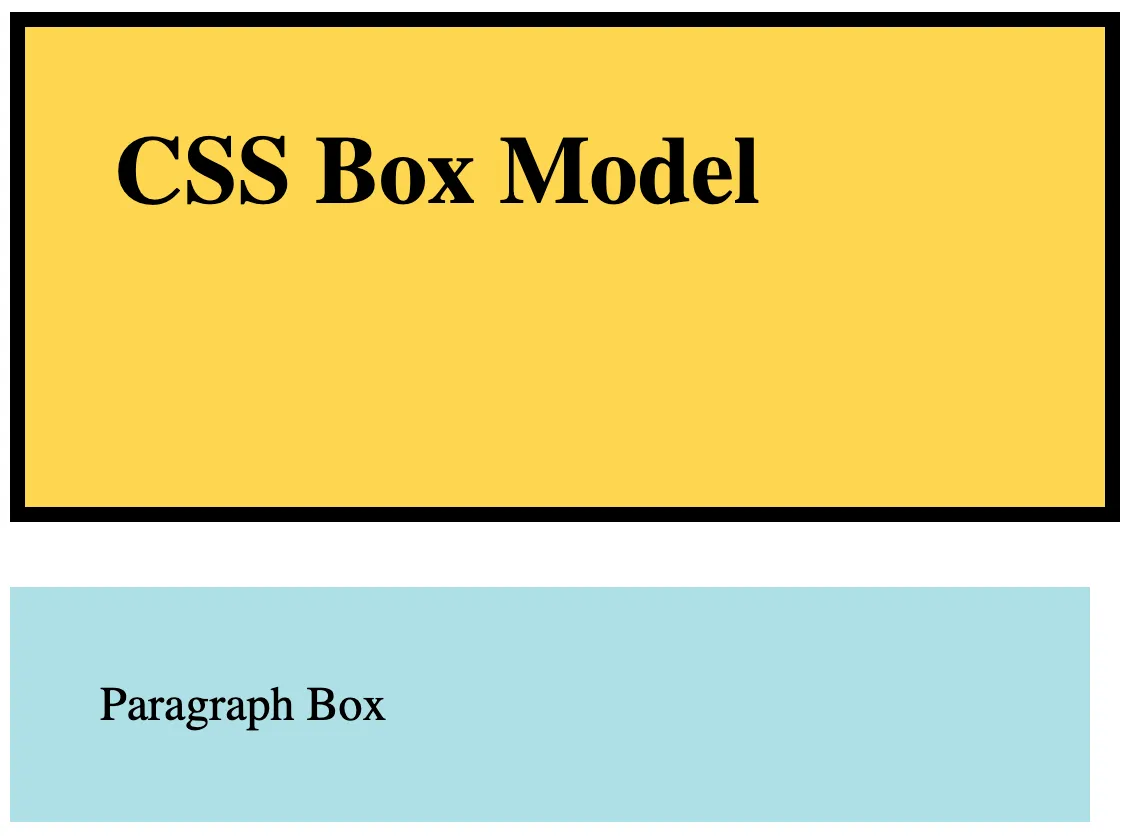
Now, we’ll add a margin to the <h1> selector. This will add whitespace around the <h1> element.
h1 {
    background-color: #FFD54F;
    width: 300px;
    height: 100px;
    padding: 30px;
    border: 5px solid;
    margin: 20px;
}
p {
    background-color: powderblue;
    padding: 30px;
    width: 300px;
}

Like padding, there are numerous ways to represent margin values as well:
margin: 30px;
- Adds a
30pxmarginaround the border box
margin: 10px 25px;
- Adds a
10pxmarginabove and below the border box and a25pxmarginto the left and right of the border box
margin: 10px 30px 20px;
- Adds a
10pxmarginabove the border box,30pxmarginto the left and to the right of the border box, and a20pxmarginbelow the border box
margin: 10px 25px 5px 30px;
- Adds a
10pxmarginabove the border box,25pxmarginto the right of the border box,5pxmarginbelow the border box, and a30pxmarginto the left of the border box
margin-top: 10px;
- Adds a
10pxmarginabove the border box
margin-right: 10px;
- Adds a
10pxmarginto the right of the border box
margin-bottom: 10px;
- Adds a
10pxmarginbelow the border box
margin-left: 10px;
- Adds a
10pxmarginto the left of the border box
CSS Series
Continue your CSS Learning.

Master flow with display types and floats
CSS — P7: Element Types And Floating Elements
Part seven of our CSS fundamentals series unpacks how element display types—block, inline, inline-block—shape normal flow, then dives into floating elements for classic side-by-side layouts. Learn float behavior, clear fix hacks, and modern flex/grid upgrades while keeping legacy pages tidy.
Know your edges, own your layout
Part eight of our CSS fundamentals series demystifies the box model—content, padding, border, and margin—showing how each layer affects size, spacing, and alignment. Learn box-sizing, collapsing margins, and debug tips to craft pixel-perfect, responsive layouts.

Layouts that just click into place
Part nine of our CSS fundamentals series tackles page layout. Compare Flexbox and CSS Grid, control stacking with positioning, harness media queries, and craft responsive, gapless designs without heavy frameworks.